Group Platform Transformation
Background
Guardian’s group area needed a way for brokers, plan holders, and onboarders to come into one site and work on a plan’s implementation phase more seamlessly and in a way that is easier to understand for a plan holder who may not be so savvy with insurance lingo.
The Dashboard
Solving this issue was extremely complex. The current system shows a jumbled mess of form fields and steps that a user would never know where to start unless they were trained to use it. Now, anyone can jump into the system and know exactly what to do next. This dashboard has a large banner with the next step in the process they have to complete and below that the next steps they have to look forward to and more things they can do like watch a tutorial video about how to use this space.
The dashboard
-

Iteration 1
Combining both elements of Guardian’s design system of media by using both illustrations and images. Main call to action features a header, subheader, description, and button to get started. Next steps and previous steps are listed in the same column together.
-

Iteration 2
Dashboard now features only images (illustrations were redacted from Guardian’s brand while project was still in progress). Next steps and previous steps are separated into tabs to keep items separate. ‘Show more steps’ link added to keep items at hand organized. Sub-header removed from call to action as it didn’t provide value. Ability to work ahead added to next steps.
Completing sections
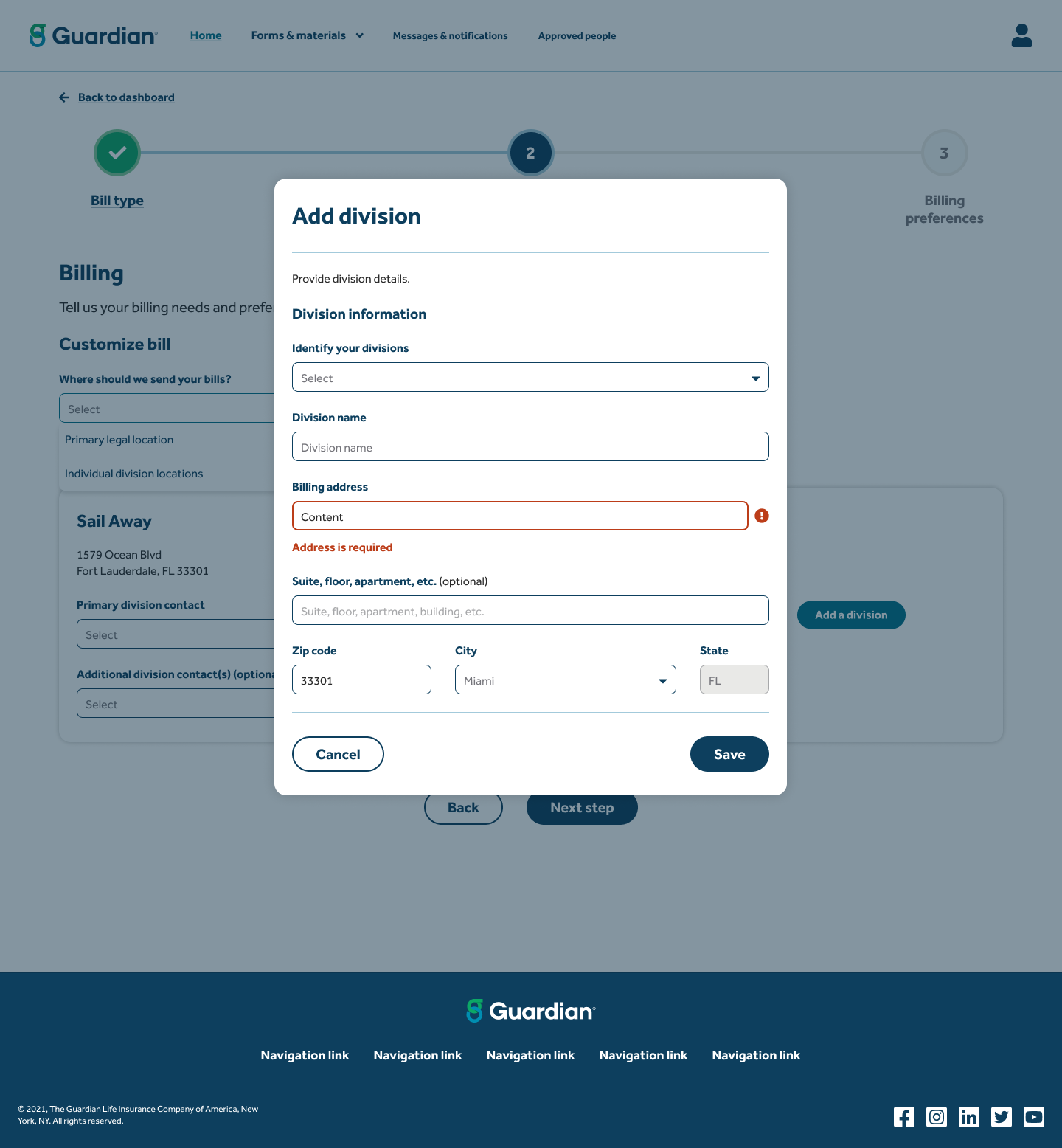
Here is an example of one of the tasks or sections that a user has to complete. They will start by clicking the Add Contact button that will take them to a modal to fill out simple information like name, role, phone, and email. Once they submit a new card will show up with that users information and from there, they will be able to configure additional information that pertains to that specific user. The reasoning behind keeping these settings separate is because many times, a user’s permissions will change periodically throughout the process. Keeping it on the card will make it easier for the plan implementation specialist to access and change it when needed.
A tour of the system.
This new system may take users a bit getting used to after using some more complex systems. And even though we’ve designed this site to be completely user friendly, we want to make our clients and brokers feel at ease with a tour of the new system when they come in for the first time.


